- Log in to the company
- Ensure you are in the new UI
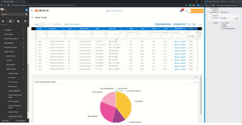
- Navigate to My Reports > System Reports > System Utilities > Global Access
- Manipulate the report to display the data desired by selecting the appropriate date range and columns to include; filtering is optional as well
- Select the
 icon to display Charts & Data; when selected it will appear as such:
- Within the Charts section (below the Data section), click the ellipsis icon
 and select Add Chart
 - A configuration panel will appear on the right-hand side of the screen
- Select the Chart type (bar, column, line, pie or heat map)
- For the Category (Y-axis), select Source Type
- For the Metric (X-axis), select Row Count
- Value Calculation will default to Count; keep it as is
- Select the remaining fields based on preference. The best practice is to start by displaying all fields and then tweaking to remove any that are not needed. Best practice also includes renaming the Chart to a meaningful name for later reference. You will want to be sure to check off Category Labels to see the Source Type.
- Click Save
- The Chart will now appear on the screen.
- To display the Chart Only, follow step 5 above and select Charts Only

English